Viewing Reports
Reports compile a set of information and present it graphically. You can use the reports to view and analyze critical information at a glance and perform timely actions as required.
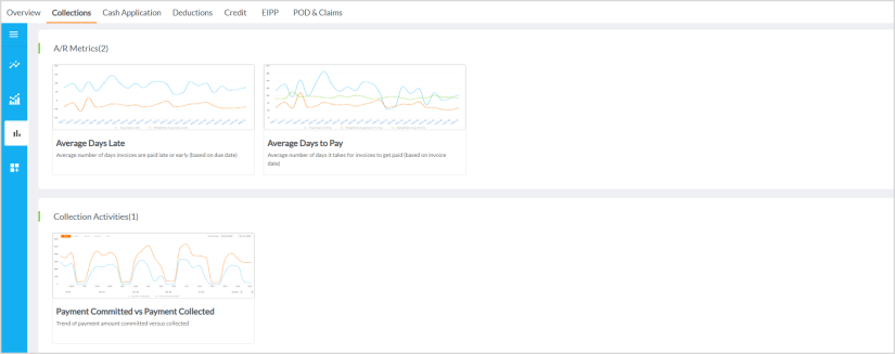
Navigate to Analytics > Standard Reports > product tab > click the report that you want to view. Each product subtab consists of various cards with report categories. Reports are placed within report category cards (arranged alphabetically).
|
|
Hint The appearance of the report depends on the type of chart used in the report. For more details, refer to Types of Charts in Reports. |
The following table lists the actions available in a report.
|
Icon or Button |
Usage |
| Back | Use this to navigate back to the previous page. |
Kebab menu  |
Use this to download, schedule, mark the report as favorite, and so on. For more information, refer to Using Kebab Menu Options. |
| Refresh Report | Use this to refresh the report. |
| Filter |
Use this to expand or collapse the filters available for the report. For more information on filters, refer to Managing Filters. |
| Help |
Use this to view a help card within the report context. The help card contains critical information such as Formula Used, Data included/excluded, and Definitions. |
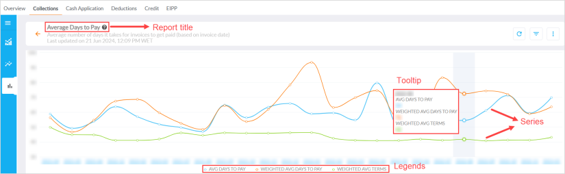
Various Parts of a Report
The following image illustrates various parts of a report.
-
Report title - The text that appears at the top of the report. An optional subtitle is displayed under the title to provide more information about the report.
-
Series - This is one or more sets of data displayed in the report. You can enable or disable the series from the legend.
-
Tooltip - When you hover over a series or a point on the report, you can view a tooltip
 A tooltip is used to specify extra information about something when the user moves the mouse pointer over an element. displaying the values of the respective datapoint.
 -
Legends - These display the details of data series on the chart. For example, blue and orange colors are used to represent two sets of data. The legend includes information about what each color represents. You can disable or enable one or more series by clicking the legend. Legends may appear at the top-right corner of the chart.
-
Last updated on - The Last updated on details are displayed under the report title. The timestamp displays the date and the time when the data was last refreshed.

Note
This feature is only applicable for Standard Out-of-the-box reports.
Types of Charts in Reports
In Analytics, different types of charts are used in reports to display different sets of data. The different types of charts in reports are as follows:
Bar Chart
The following is a sample of the bar chart. Data is represented in the form of horizontal bars.
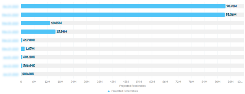
The horizontal values denote the X axis while the vertical values denote the Y axis. The tooltip![]() A tooltip is used to specify extra information about something when the user moves the mouse pointer over an element. that appears when you hover over any bar displays the values of the data in X axis and Y axis.
A tooltip is used to specify extra information about something when the user moves the mouse pointer over an element. that appears when you hover over any bar displays the values of the data in X axis and Y axis.
Column Chart
The following is a sample of the column chart. Data is represented in the form of vertical bars.
The horizontal line represents the X axis. The vertical line represents the Y axis. In this chart, the Y axis displays two sets of values as displayed in the legend. The tooltip that appears when you hover over any point in the chart displays the values of the data in X axis and Y axis for that point.
Spline Chart
The following is a sample of the Spline chart. Data is represented in the form of curves.
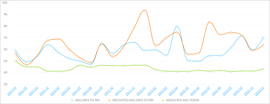
The horizontal line in the bottom represents the values for X axis. The vertical line represents the values for the Y axis. The tooltip that appears when you hover over a point in the series displays the values of all parameters.
Grid
The following is a sample of the grid. Data is represented in the form of different columns in the grid. Each column represents a set of details.
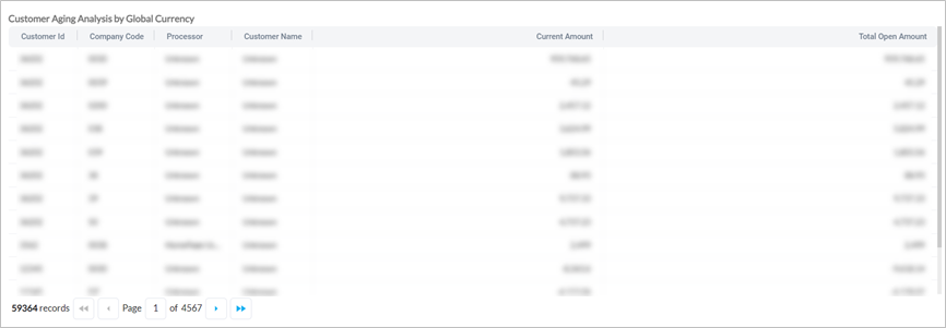
Some columns in the grid contain hyperlinks that can be used to open the drill-down reports![]() Some reports provide the option to view additional details for a specific data point in the form of drill-down reports. These reports allow users to focus on the data within a single data point.. For more information, refer to Viewing Drill-down Reports.
Some reports provide the option to view additional details for a specific data point in the form of drill-down reports. These reports allow users to focus on the data within a single data point.. For more information, refer to Viewing Drill-down Reports.
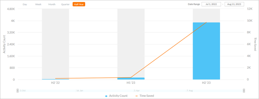
Time Series
Some charts represent data points that are captured at regular time intervals. Such charts where the represented data is captured over regular time intervals are called time series charts. Time is always represented in the horizontal axis. Time series charts are essentially regular charts (bar, column, or spline), but with the time elements. The following is an example of a time series chart with poly lines.
|
|
Hint The series in a time series chart may be in the form of bars, column, or splines. |

The horizontal line denotes the X axis while the vertical line denotes the Y axis. The tooltip that appears when you hover over a series displays the day, date and the values of the X axis and Y axis for that particular data point.
You can view the data for a Day, Week, Month, Quarter, or Year, by selecting an option in the Show data by field. You can also manually enter a time period in the Date Range field. The data in the report is displayed based on the values provided in these fields.
The time series chart also consists of a navigator in the bottom. You can drag the navigator to adjust the time period based on which the data will be displayed in the report.

|
|
Note Reports with time series cannot be scheduled. Hence, the Schedule icon is not available. |
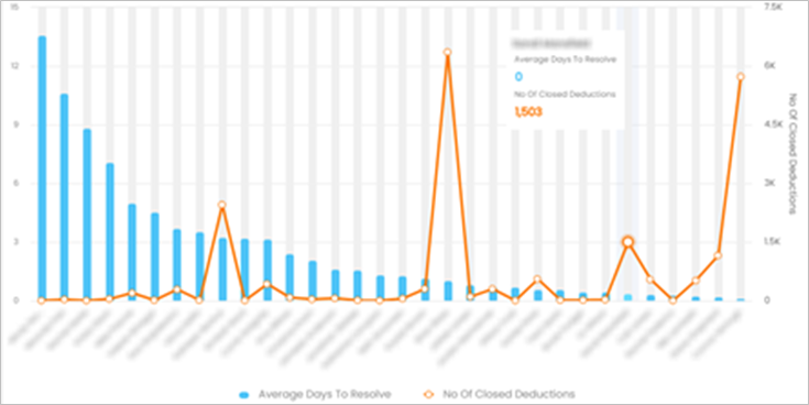
Some reports may also use elements from multiple charts. For example, the following report uses a bar chart to represent one data set along with a poly line chart to represent another data set.